Subscribe to our LinkedIn so you don't miss important media news and analysis
What makes an article more readable? Shorter paragraphs? More images and less text? Larger size of the text? Simpler language? Less ads? Specific font?
A little bit of all. Here, I want to focus on two aspects of readability – plain language and fonts. The data shows that both are overlooked – and we should pay closer attention to them as an industry.
Recently, The Pudding, a digital publication that explains ideas debated in culture with visual essays, published a new piece titled What makes writing more readable?. It has an alternative version entirely rewritten in plain language.
For journalists, it is important to think of the audience and whether they are able to understand the news. The Pudding pointed out that 20% of the U.S. population has learning disabilities, and other research shows that more than 7 million people in the US suffer intellectual disabilities (ID). For some readers, English is not their first language, and still others have limited access to education, among other factors.
In Europe, 15% of the population is dealing with dyslexia or some sort of learning disorder.
In other words, if you are only writing for the highly educated and not thinking of all of your audience, the way you write will create barriers.
Sure, a feature piece like the one from The Atlantic staff writer Jennifer Senior for which she won the 2022 Pulitzer Prize wouldn’t be a winner if written in plain language as that takes away some of the nuance of the text. But, for most topics most of the time, reaching as many people as possible is more important than impressing the Pulitzer board.
A few years ago, I bought the Thing Explainer: Complicated Stuff in Simple Words book, which explains things by using only drawings and a vocabulary of the 1,000 most common words.
Randall Munroe, the author of the book and also the popular webcomic xkcd, explores computer buildings (datacenters), the flat rocks we live on (tectonic plates), the things you use to steer a plane (airliner cockpit controls), and the little bags of water you’re made of (cells).
It’s another great example of how you can, using limited, simpler vocabulary, explain complicated subjects.
More than ten years ago, a study by psychologists at Princeton and Indiana University had 28 men and women read about three species of aliens with specific characteristics – color of eyes, what they eat, how they look.
Half the participants studied the text in 16-point Arial font, and the other half in 12-point Comic Sans MS or 12-point Bodoni MT, which are considered to be harder for the brain to process (mind you, this was more than ten years ago, Comic Sans already faced public opposition but nowhere near the current perception).
The results? The participants who had studied in the harder-to-read fonts outperformed the others on the test. The researchers conducted another similar experiment, this time on a larger group of 222 students. Again, students who studied the class materials at the stranger typefaces did significantly better at the exam than the others in all the classes.
“The reason that the unusual fonts are effective is that it causes us to think more deeply about the material,” one of the co-authors explained. Our brain has a natural tendency to find shortcuts and to quickly forget that it used them.
The results of this study were replicated again a decade later by researchers in India who measured reading time, ranking and mental workload. Readability was better for serif compared to sans serif. Reading time was minimum for Courier New 14 point, a serif font (specifically slab serif), yet sans serif fonts were preferred more by subjects.
Another recent study from 2022 looked at the reading speed based on various fonts. Participants’ reading speeds were measured in word-per-minute (WPM). The authors found that there is a wide gap between fastest (Garamond) and slowest fonts (Open Sans) to read in.
The researchers conducted a reading-speed study with 352 participants. The participants read short passages of text (~300–500 words) written at an 8th grade reading level and shown in 16 different fonts, although each participant only read texts in 5 of them to maintain reading-effectiveness test.
Still, the winning Garamond font wasn’t the best for all participants; younger ones read faster when text was written in other fonts.
Jakob Nielsen of NN/g has a good take on the study. He writes that, if different fonts are best for different people, an easy solution might be to include a preference setting for readers to choose the best one for them.
But Nielsen also answered to himself that this would never work as previous research has shown users don’t use preference settings and simply go with the default options.
A possible solution might be a browser-level customization setting that would make users read text in different fonts and estimate the best option which would be set for the reading experience.
Even though the study doesn’t bring a definitive answer, it shows how a bad font choice for a particular audience means a worse, slower reading experience.
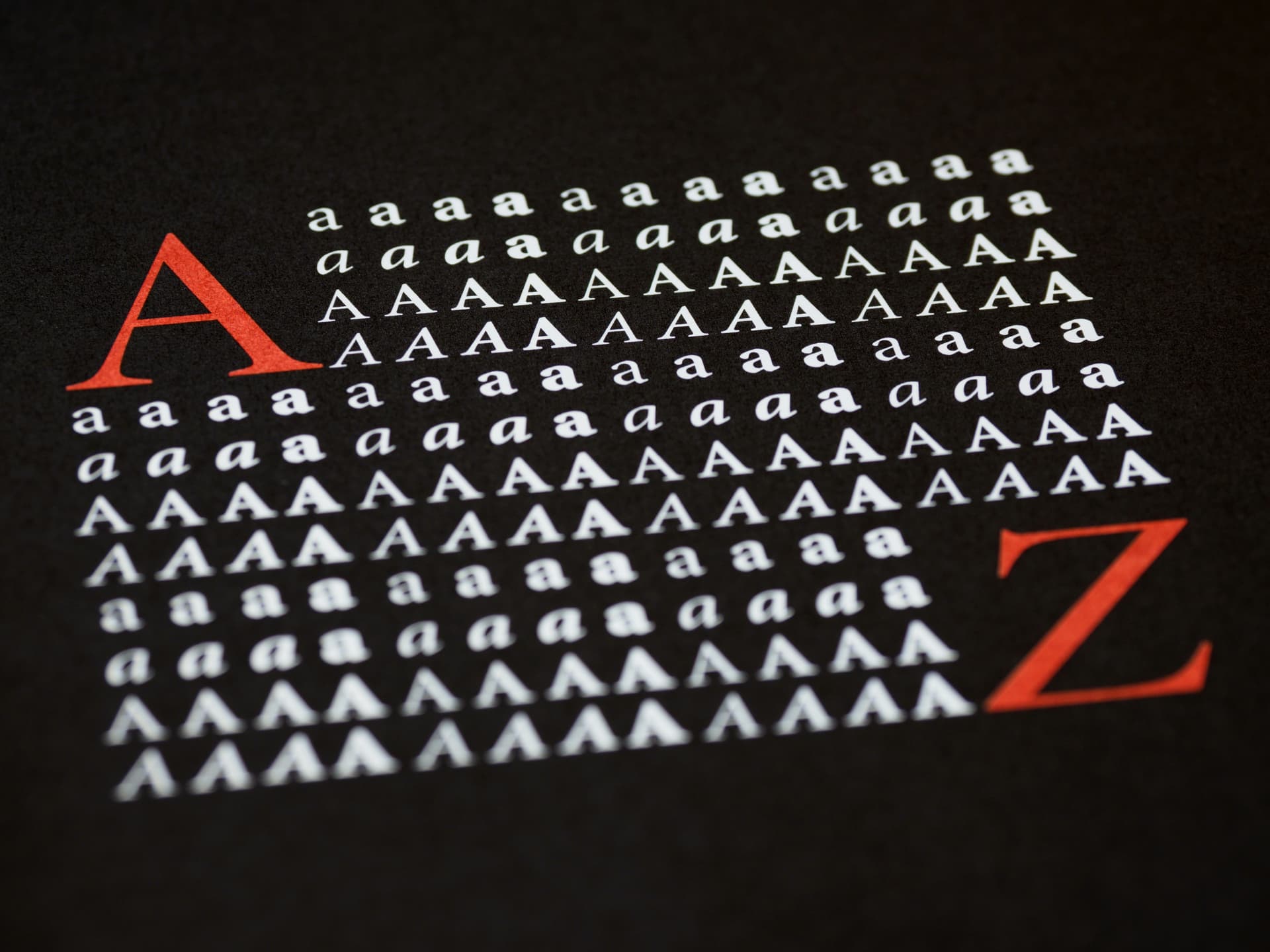
Photo by Brett Jordan on Unsplash
Everything you need to know about European media market every week in your inbox
Hi! I'm David Tvrdon, a tech & media journalist and podcaster with a marketing background (and degree). Every week I send out the FWIW by David Tvrdon newsletter on tech, media, audio and journalism.
We are using cookies to give you the best experience on our website.
You can find out more about which cookies we are using or switch them off in settings.